Rebrandings: Optimove, Spotware, TradersYard And FXGT With New Looks
Christian Görgen • September 13, 2025 • 6 min read

Rebranding is one of those topics that always sparks discussion. I’ve noticed it many times – design changes tend to bring out strong opinions across a company.
Part of the challenge is that branding affects everyone. In other areas, like Sales, Finance, or IT, colleagues usually trust the specialists. But when a new logo, font, or website design comes out, almost everyone has an opinion about it. That variety of perspectives can be helpful in the early discovery phase, but it can also make the process more complex.
And it’s not only the internal teams who speak up: customers, partners, and the wider public often have something to say as well.
So now I am adding another angle to it, let’s dive in.
Why Companies Rebrand
Rebranding often happens when a company enters a new stage of growth. Early on, brands are usually created quickly, something simple just to get started. But as the business matures, that first design often no longer reflects what the company truly stands for.
Sometimes a new marketing lead drives the change, bringing in fresh ideas. Other times, it’s less about people and more about necessity: trends evolve, customer expectations shift, and what once felt modern starts to look outdated. Ten years ago, shiny gradients, shadows, and playful effects were popular. Today, the trend has shifted toward minimalism, clean lines, and clarity.
Optimove: A Sharper Look With Darker Colors and Stronger Identity
One brand that keeps evolving is Optimove. The most recent design change has shifted from soft, playful, rounded elements to sharper, more structured visuals. To me, that signals a move from a startup aesthetic toward a more mature, enterprise-ready identity.
What’s interesting is that they’ve doubled down on their positioning around “positionless marketing” – a concept they coined themselves and continue to push in demand generation. I’ve noticed several employees using the term in their social media posts too, which shows it’s being well adopted internally. It’s a smart angle that gives the brand a unique narrative.
The biggest change is the logo. Optimove switched from lowercase to uppercase, making it more confident and corporate. The new design also integrates different shapes, representing the various marketing disciplines the platform connects. It’s worth noting that this isn’t Optimove’s first rebrand – like many startups, they’ve experimented with different versions over the years.
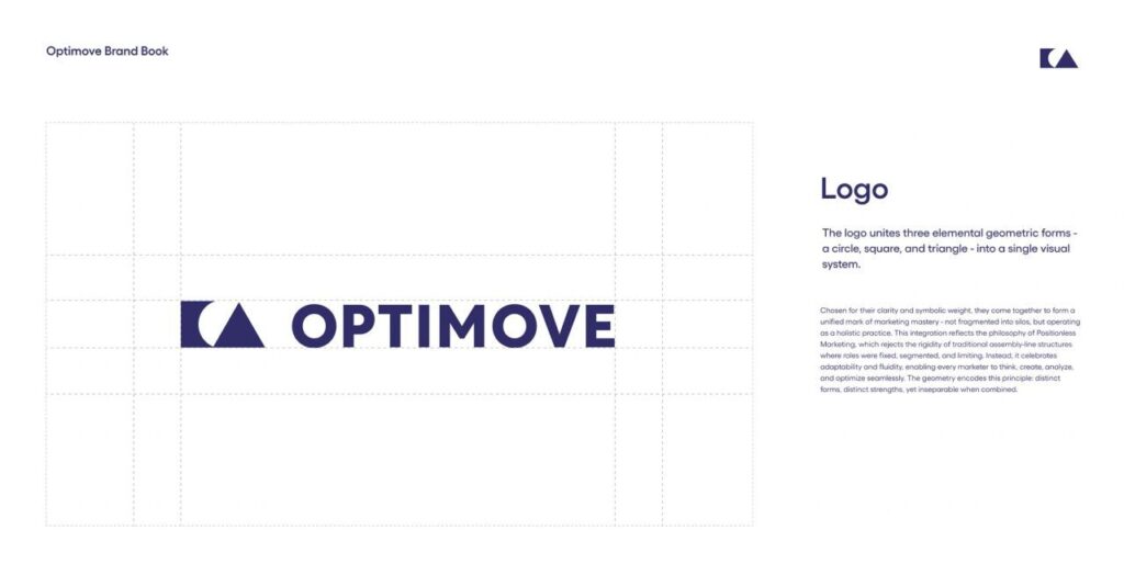
Optimove’s new logo: bold uppercase & 3 elements reflecting Positionless Marketing
Visually, the updated illustration style and color palette stand out. The sharper lines and modern tones create strong associations with data and technology, moving away from the softer aesthetic many brands still use today.
Color-wise, the brand has left behind its bright orange and moved toward a calmer palette of lime and dark purple. It feels more sophisticated, while still keeping some energy and freshness.
Spotware: Creative Rebrand With Artsy, Fashion-Inspired Illustrations
Spotware’s new logo comes with a lighter, more energetic green that replaces the older, darker shade. The new tone feels fresher and more action-oriented – adding a sense of urgency compared to the calm, corporate vibe of the previous version.
What really stands out are the illustrations. They feel like they were created by someone outside of the traditional “trading brand” aesthetic, with a more artsy, fashion-inspired look. The contrast works well: on one hand, you’ve got a technical, clean corporate feel; on the other, playful, pop-culture-like visuals that give the brand personality.
Overall, it’s refreshing to see a company in this industry put real effort into trying something new. Spotware’s new direction feels creative and modern – a welcome change in a space where design often tends to look the same.
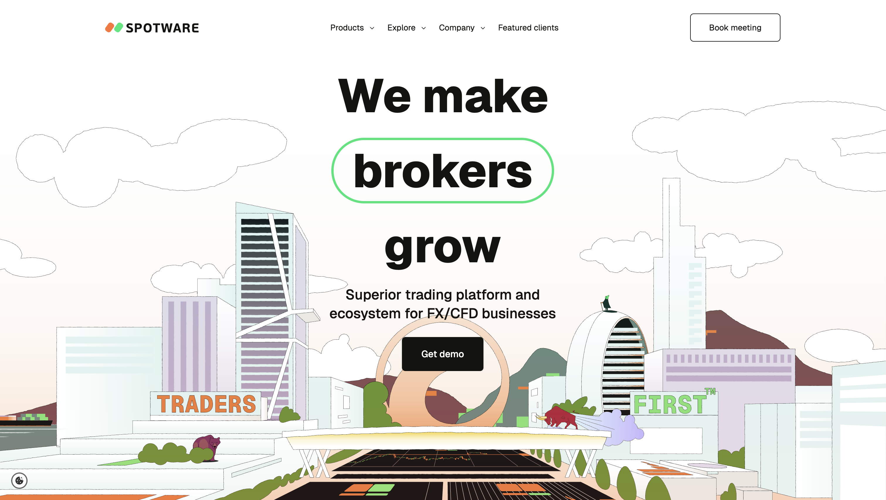
Artsy illustration of the Limassol skyline where Spotware is headquartered.
FXGT.com: Website Makeover Brings Minimalism and Clarity
The first thing that stands out on FXGT’s website refresh is the cleaner, more minimal design. The heavy, rounded “clunky” 3D elements have been phased out, replaced by a flatter and simpler visual style. The dark navigation bar has also given way to a lighter header, paired with a logo on a white background – a shift that adds clarity and a more contemporary look. The “GT” illustration in the background on the homepage looks elegant but reminds me a bit of Trive, though maybe I’ve just seen their logo too often when they were the sleeve sponsor of Bayer 04 Leverkusen.
Overall, the new design uses more whitespace and a softer color palette, which makes the site feel less busy than before. From a structural perspective, not much has changed: navigation and content remain largely the same.
If you want to see the contrast, FXGT’s partner site still reflects much of the old style – an interesting side-by-side comparison.
TradersYard: Bold Rebrand With an Entirely New Visual Identity
The last rebrand in this lineup comes from the Austrian prop trading firm TradersYard.
When I first came across the original brand, I found it strikingly different from typical trading aesthetics. It leaned more toward lifestyle, fashion, or even sports branding – not necessarily a bad thing, since it gave TradersYard a unique edge but unusual and difficult to graps quickly what it is all about.

TradersYard’s old brand direction: more lifestyle, fashion, and sports (basketball?) than trading.
That said, for a company actively targeting traders and trying to establish a stronger market presence, the style may not have been the best fit. In that sense, the decision to rebrand feels logical and timely.
The new identity is a complete departure from the old look. None of the previous elements were carried over, which is a bold choice – it always comes with the risk of having to rebuild brand recognition from scratch. Still, the new design feels structured and much more aligned with the trading industry.
It looks like the rebranding has only just been finalized, so I’m curious to see how it develops further in the coming weeks and what additional brand elements will be introduced.
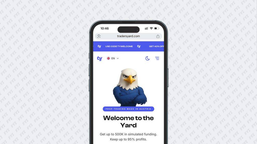
TradersYard uses illustrations now instead of lifestyle images
What Makes Rebranding So Difficult
As we’ve seen, every company takes a different path when it comes to rebranding. Some opt for a complete 360° transformation, while others carefully refine and evolve what they already have.
The real difficulty lies in the fact that design is something everyone has an opinion on. Personal taste can be a dangerous trap: a brand that feels “pretty” to you internally might miss the mark with your target audience.
At the end of the day, design isn’t about decoration. It’s about function and making sure your brand communicates the right message instantly. Especially in trading, where the market is highly competitive, you can’t afford to confuse users or look out of place. On the other hand, playing it too safe and blending in as “just another broker” won’t help either.
The sweet spot is a brand that is clear, credible, and recognizably trading — but still distinct enough to stand out.
If you’re considering a rebrand and want an overview of what others in the industry are doing, let’s talk.
You Might Also Like

2nd MMG HR Summit Mediterranean to Gather Senior HR Leaders, CEOs, and Founders in Limassol
PRESS RELEASE The 2nd MMG HR Summit Mediterranean, one of the key HR and people leadership gatherings in the Mediterranean region, will…

Online Broker Hiring Report Q1/2026 – Job and Growth Trends in FX
This report analyses 1,400+ open roles across the 50 largest brokers and highlights the key hiring trends.

The New Generation Of Prop Traders
This article was originally published in the September 2025 edition of TRADERS magazine. The version below is an English translation of the…

Marketing Budget Allocation 2026
With 2026 approaching quickly, now is the time as an Online Broker or Prop Firm to set your marketing priorities for next…